Creating the perfect dispensary is an artful balance between too much and too little. Too much stuff—counter cards, posters, and displays—may look cluttered; too little gives the appearance of a lack of choices.

CALCULATED IMPROVEMENTS
Visual Merchandising enhances a professional identity. It differentiates your office. There’s a return on everything from a complete remodel to the reason that a frame occupies a space on the board. It can make an immediate change to profitability.
Eyewear does not sell itself, regardless of how well it is designed, how appropriately it is priced or how high or low it sits on the frameboard, and it needs a little something extra.
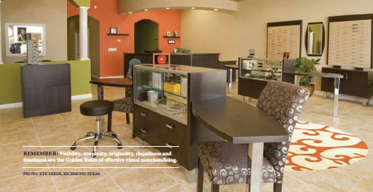
Consider the backdrop for the product or the environment for your frames. A great backdrop doesn’t necessarily mean a complete store redesign or expensive cherry display cases. A little can go a long way.
SOLUTION
Consider the vibrancy of a green wall, consider adding a whimsical rug and match the color tones of the rug in another wall. The walls provide contrasting colors but the rug causes the eye to connect them. Be sure that the colors, cabinets and design reflect the identity of the office. Patients will sense the staff’s comfort and be comfortable, too.


