By Linda Conlin and Preston Fassel
In an age when brick and mortar must compete not just with online but big box and other opticals, presentation is key to not only differentiating yourself from the competition but providing patients with a pleasing ambiance and atmosphere to encourage browsing and purchasing. If done well, good presentation can lend generous dividends. In-store visual presentation is accountable for the majority of retail purchases, according to Joseph Weishar, author of The Aesthetics of Merchandise Presentation (2005, stmediagroup.com/stbooks). How then does an optical retailer—especially one attempting to compete by offering patients the boutique experience—succeed through presentation?
Look from the outside in. The store has to be inviting, drawing shoppers to attractively displayed frame collections. And merchandise inside has to be visually inviting. The art of display lies in creating visual impact through elegant simplicity. Effective eyewear displays meet all of these four basic shopper/patient needs: Merchandise 1. Is easily seen. 2. Is touchable and accessible. 3. Has enough choices but not too many, and 4. Has clear visual cues to price and value.
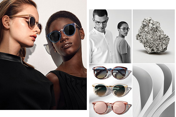
If you’re going to be successful, offer patients an experience. A key strategy that will set you apart from the in-out-wham-bam of big boxes and chain retailers is to present luxurious and aesthetically pleasing frame lines. MODO sits beautifully at this intersection. Drawing inspiration from the aesthetics of New York, Milan and Stockholm, the line reflects the best of the world’s fashion enclaves while also being relatable and accessible to a wide variety of patients. (How many “luxury” lines are cumbersome and ostentatious to the point that they only look good on a limited number of individuals?) The result is a quality line that lets you stand out from the crowd. They’re quietly elegant without screaming “elegant” in a way that makes them approachable—and therefore, purchasable. Look no further than MODO’s own P.O.P. for evidence of this, where the frames are displayed proudly on the faces of models who are strutting down a runway and on smiling couples who don’t appear to be doing anything more luxurious than spending a Sunday afternoon at home. You can bring the same sophistication to your practice with artful and creative visual merchandising.
How frames are displayed is only part of the presentation, though. Everyone loves a story, and a well displayed pretty pair of glasses appeals more to the rising number of socially conscious consumers, especially Millennials, when wrapped in a story about the manufacturer and their socially responsible practices. MODO is one company with a great story. Effectively Millennials themselves, MODO was born in 1990 in the Soho section of New York City. A native of Italy, founder Alessandro Lanaro named the company appropriately. In Italian, MODO means “my way,” and the MODO way is beautiful, innovative design, such as frames with a metal core embedded in the plastic frame front, a new way of manufacturing plastic frames that they developed. Even better, another MODO way is to use bio-based fuels to make its frames, and it promotes eco-friendly practices worldwide such as its One Frame – One Tree program, through which it donates and plants a tree for every ECO frame sold. What’s more, ECO frames are made of 95 percent recycled materials, demonstrating MODO’s commitment to its customers and the environment.
MODO presents an excellent opportunity to help enhance the boutique experience for you and your patients. Bonus points? For every frame purchased, MODO contributes to its Help a Child See program, a partnership with Seva, a global nonprofit eyecare organization that provides vision screenings and eyewear to children in more than 20 countries around the world. Everyone wins—and looks good doing it.
For insight into how MODO creates frames with an elegance that appeals across demographics, check out our CE “Why You Should Know How Frames Are Made” at 2020mag.com/ce.


